Karma Drinks
The cola that paid its way back. A brand built so the can in your hand could fund a school in Sierra Leone — without you having to think about it.
In 2010 there was no shortage of cola. There was a shortage of cola you could drink without feeling complicit. Karma was built to close that gap — a genuinely good cola, sourced from the same Mende cola farmers whose nut had given the drink its name a century earlier, with one percent of every sale committed back to those communities in perpetuity.
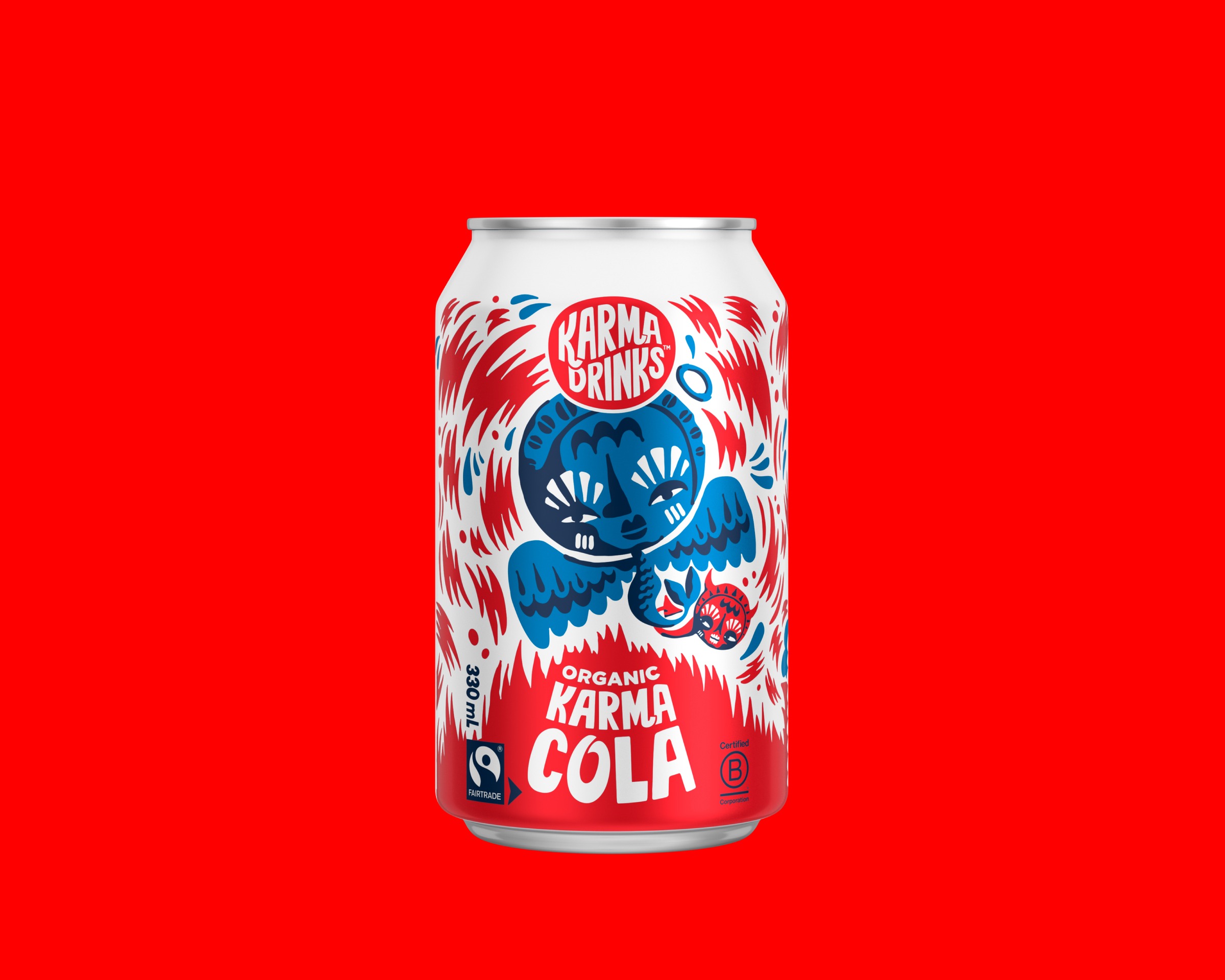
The brand made that argument with one move. The can is the artwork. A central illustration — a Mende goddess figure flanked by bird wings, drawn in confident red and royal blue — that read as ritual object, not packaging. No photography, no product description, no shelf-marketing tricks. The figure carried the brand into rooms most colas couldn't enter: independent cafés, organic grocers, restaurants that took their drinks list seriously.
Then it carried four. Cola, Gingerella, Lemmy Lemonade, Razza Raspberry Lemonade — four flavours, four characters, four chord-matched grounds. Red for the cola goddess. Orange for the Gingerella head-of-hair. Yellow for Lemmy walking through his own daydream. Pink for the Razza skater. Same illustrator's hand, same Karma logo locked at the top, same confidence on shelf — but each can was its own world. The family was the proof: every drink got the design argument applied at full strength, not diluted across a stretched master brand.
The strategic risk was that "good for the world" colas usually look pious. Karma's design refused that. The graphic confidence put it on shelf next to Coke and Pepsi as a peer, not a worthy alternative. Fifteen years on, the family still reads as itself — which is the rarest thing a brand can do.
Editorial — Simon's fill: the founding moment with the co-founders; the conviction that purpose only works if the product wins on its own terms; specifics on the UK launch and how the brand crossed; the moment you realised the design argument had held. Also: the illustrator's name across all four cans (and any continuity / handover credits if the line was illustrated over time), the typography hand, the Mende goddess source — these credits matter and the TK list above needs filling.
Karma Cola. The Mende goddess, drawn in red and blue, on red.
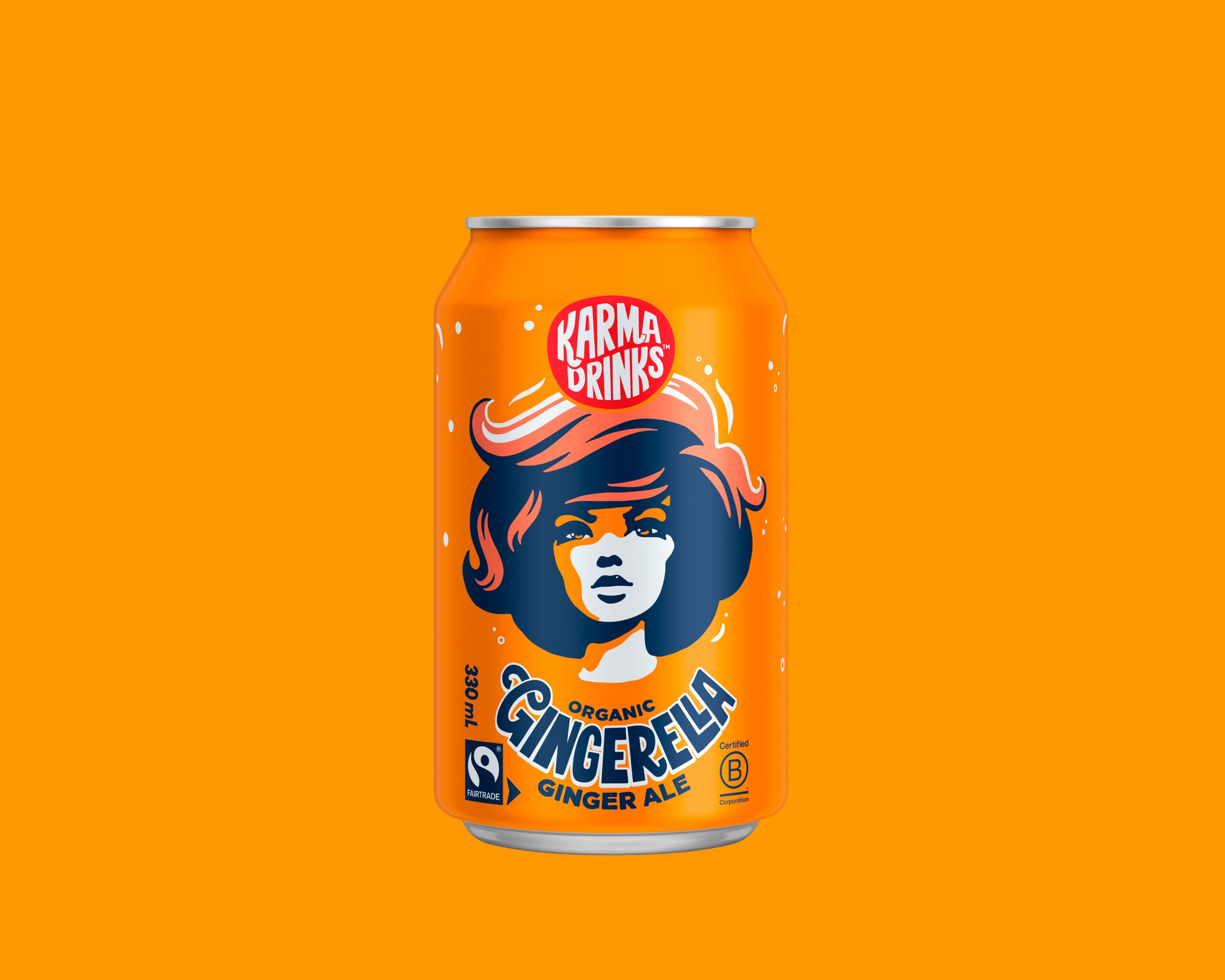
Gingerella Ginger Ale. The fire in her hair is the ginger.
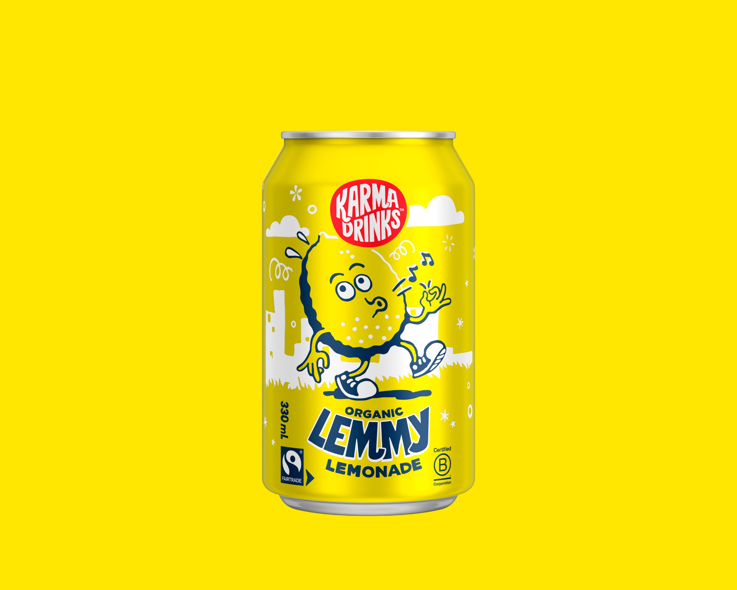
Lemmy Lemonade. A lemon walks through his own daydream.
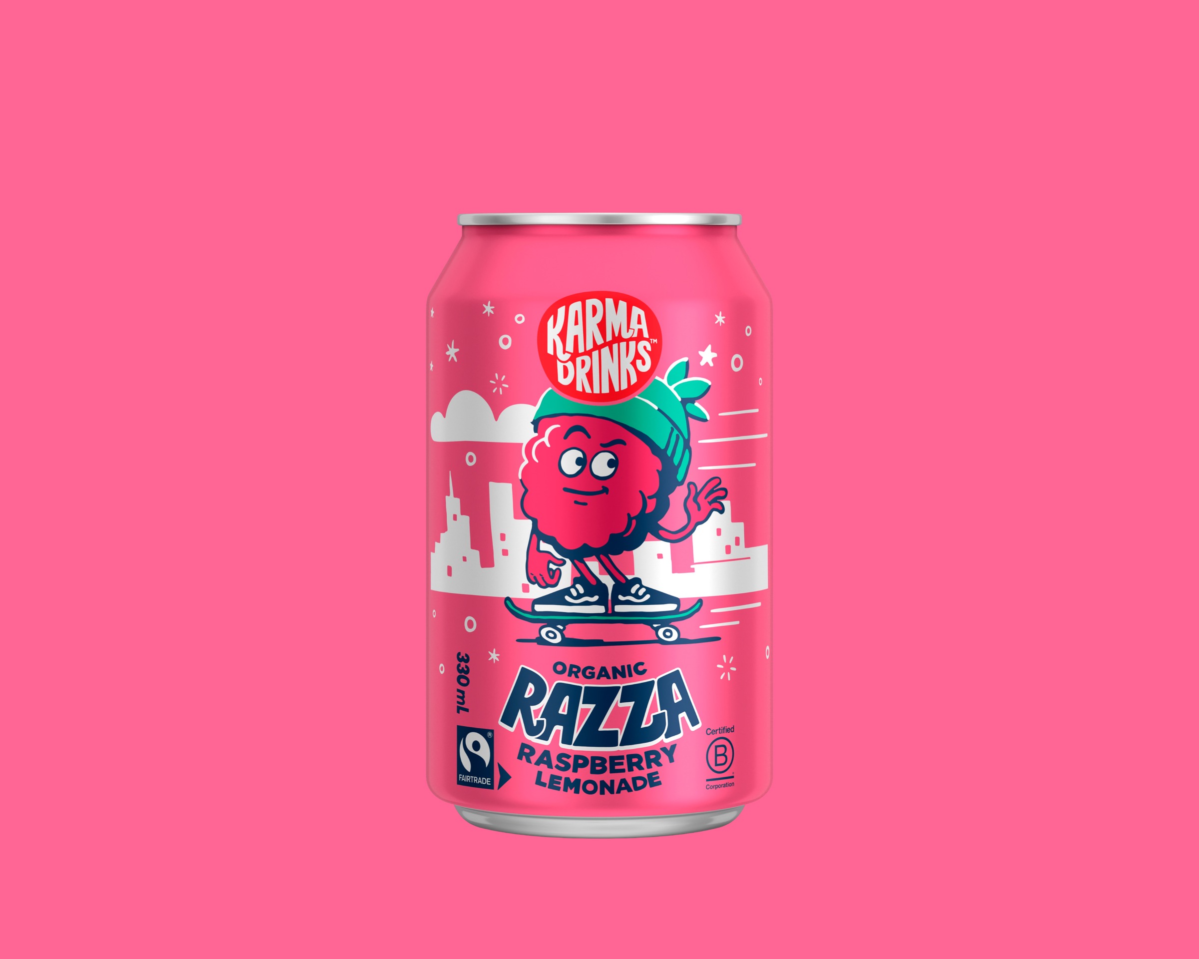
Razza Raspberry Lemonade. The skater.